Plot your data on Any Map/India Map in Google Data Studio for reports !

Hello Tech Maniacs !
First of all, pardon me for not posting anything from past one year in this channel. You would be getting at least one “informational tech post” per month from here on .
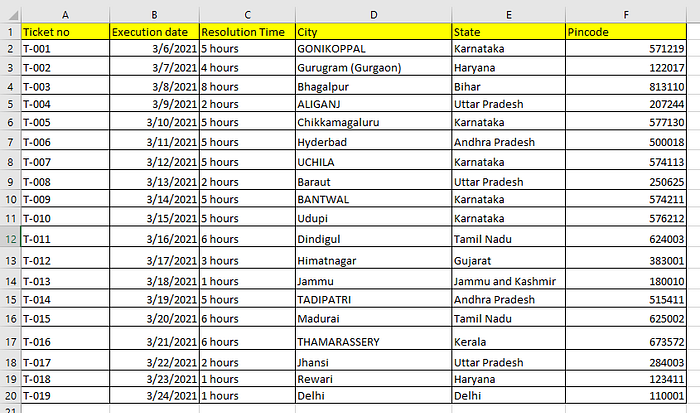
So well coming back to topic , I am working in a Tech Startup where we serve our customers at Pan India Level. So in a month, we are working on around 150–200 tickets for one of our mainstream Customer . Now at the end of every month, we generate a monthly report and share back to them in a clean Excel/csv where we show them the complete data , like which location , which pincode , which address and in how much time we finished the tickets for them and other information details.
Now the csv itself says everything about the report but what if I have the capability of showing this data on an India MAP ? What If I can show them on a map that these locations I have served . Wouldn’t it look good ? Wouldn’t it make your report more presentable ? Well definitely YES ! Lets start how to do this from your reports .
HOW TO PLOT ON MAP ?
So first of all let me show you how my sample report looks like :

Now I need to plot a graph from this report. Now in order to plot the report on a Map in “google data studio” ,you need one out of these 4 things :
- City
- Postal code
- Address
- Latitude/Longitude
So I personally choose either “Postal code” or “Lat/Long” to plot my Map graphs. Now lets open Google Data studio :
https://datastudio.google.com/u/1/

Click on Blank Report , then it will ask you to choose the Data source from where you want to pick your data .

Now you can upload your CSV ( you can go through this link if you have issues uploading your CSV , https://support.google.com/datastudio/answer/7333350#zippy=%2Cin-this-article ). Well my report is over Google Sheets, so I am choosing Google sheets as my data source .

Once you Authorize , it has the access to your Google sheet.

Now I can see all the Google sheets of my account. Now choose your report and click “Add”.

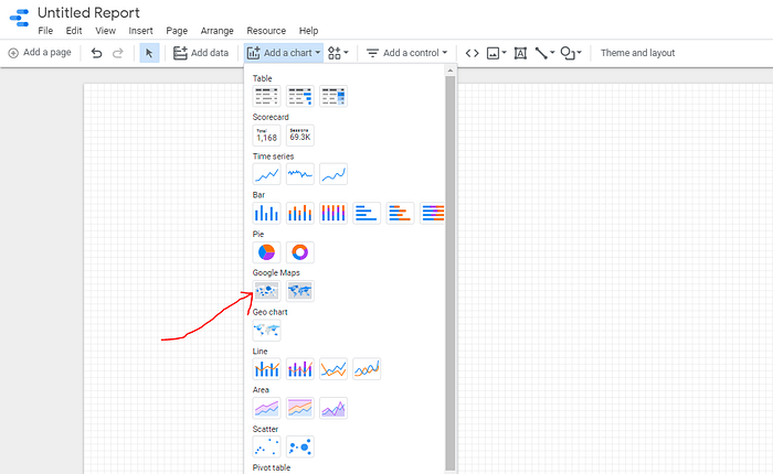
Choose Bubble Map, and then choose your datasource .

Once you have selected your datasource , make your to click on the pencil icon in front of it , because as of now pincode is been taken in “number” format by Google data studio, we need to change the pincode section in postal code format . Lets do it :

Now you are all set , just choose pincode under Location and tooltip section and kaboom !

I have chosen pincode column under location and tooltip and has successfully plotted it on the India Map. Please explore other section under DATA and STYLE , there are many things to play around there .
Try it yourself !
Hope you liked the blog , please leave a clap if you liked it and suggest me for more interesting blogs in future . Happy weekend .
Cheers !
